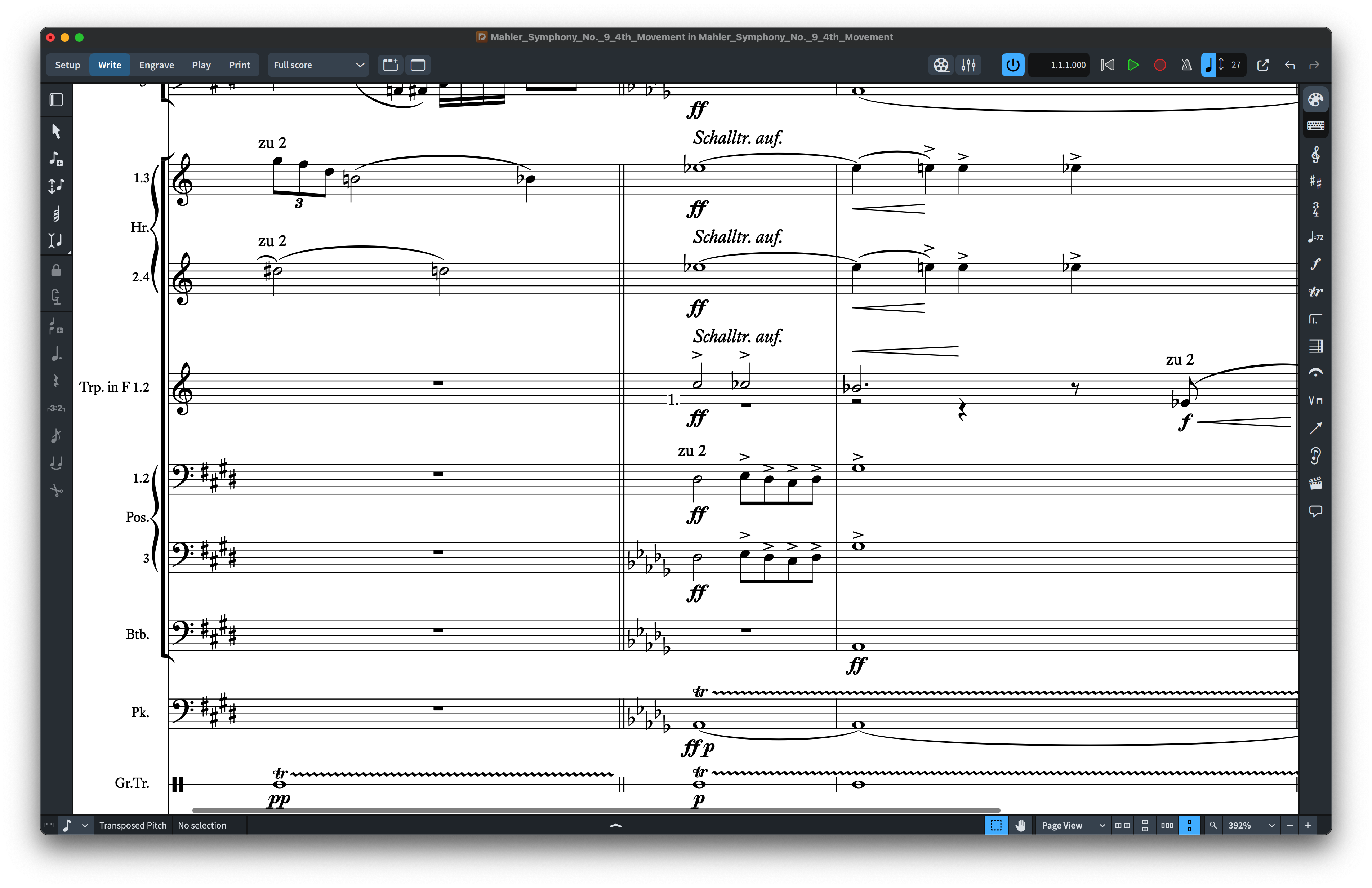
For professional engraving, the best music notation font is the one that supports the musical context, stays readable at realistic staff sizes and gives the page a coherent visual voice. In 2026, engravers can choose from several established music-font traditions: traditional engraved styles, contemporary printed designs and handwritten or copyist-inspired families.
This guide focuses on practical selection rather than declaring one universal winner. If you want to compare NorFonts families directly, start with Compare NorFonts or browse Engraved Music Fonts.
What professional engravers should judge first
A strong notation font should be evaluated as a complete system, not as a handful of attractive glyphs. Pay attention to noteheads, accidentals, rests, flags, clefs, articulations, dynamics and numerals together. The most important question is whether the page remains balanced when the music becomes dense.
Traditional engraved character
Traditional engraved fonts work especially well for classical repertoire, scholarly editions, chamber music, orchestral scores and printed parts. Their value is not simply formality: a good engraved family creates visual hierarchy without distracting from the music itself.
NorFonts families in this category are designed for users who want a distinctive printed identity while keeping a modern digital workflow. See the Engraved Music Fonts collection for current options.
Contemporary engraved styles
Not every publication needs a historical engraving look. Contemporary fonts can feel lighter, more open or more neutral while still maintaining the discipline required for professional notation. They are often a good fit for new-music editions, educational material and publishers who want a recognizable house style.
Handwritten and copyist-style alternatives
For jazz, commercial arranging, Broadway-style charts and lead sheets, handwritten notation may be the more authentic professional choice. A carefully designed handwritten music font can preserve clarity while bringing the energy of traditional copyist work to digital scores.
Browse Handwritten Music Fonts and Jazz Music Fonts for these styles.
Compatibility matters as much as appearance
Before choosing a font, confirm the correct edition for your software. NorFonts SMuFL editions are intended for modern SMuFL-aware workflows including Dorico, Finale v27+ and MuseScore 4.6+, while Sibelius uses dedicated NorFonts editions.
Use SMuFL Music Fonts, Dorico Music Fonts, MuseScore Music Fonts or Sibelius Music Fonts to choose the correct package.
Score excerpts: engraved versus handwritten fonts
The following excerpts come from actual NorFonts score PDFs, not isolated glyph charts. They show different musical passages; compare their overall typographic texture rather than treating them as an identical-measure experiment. Select each image to see it enlarged.
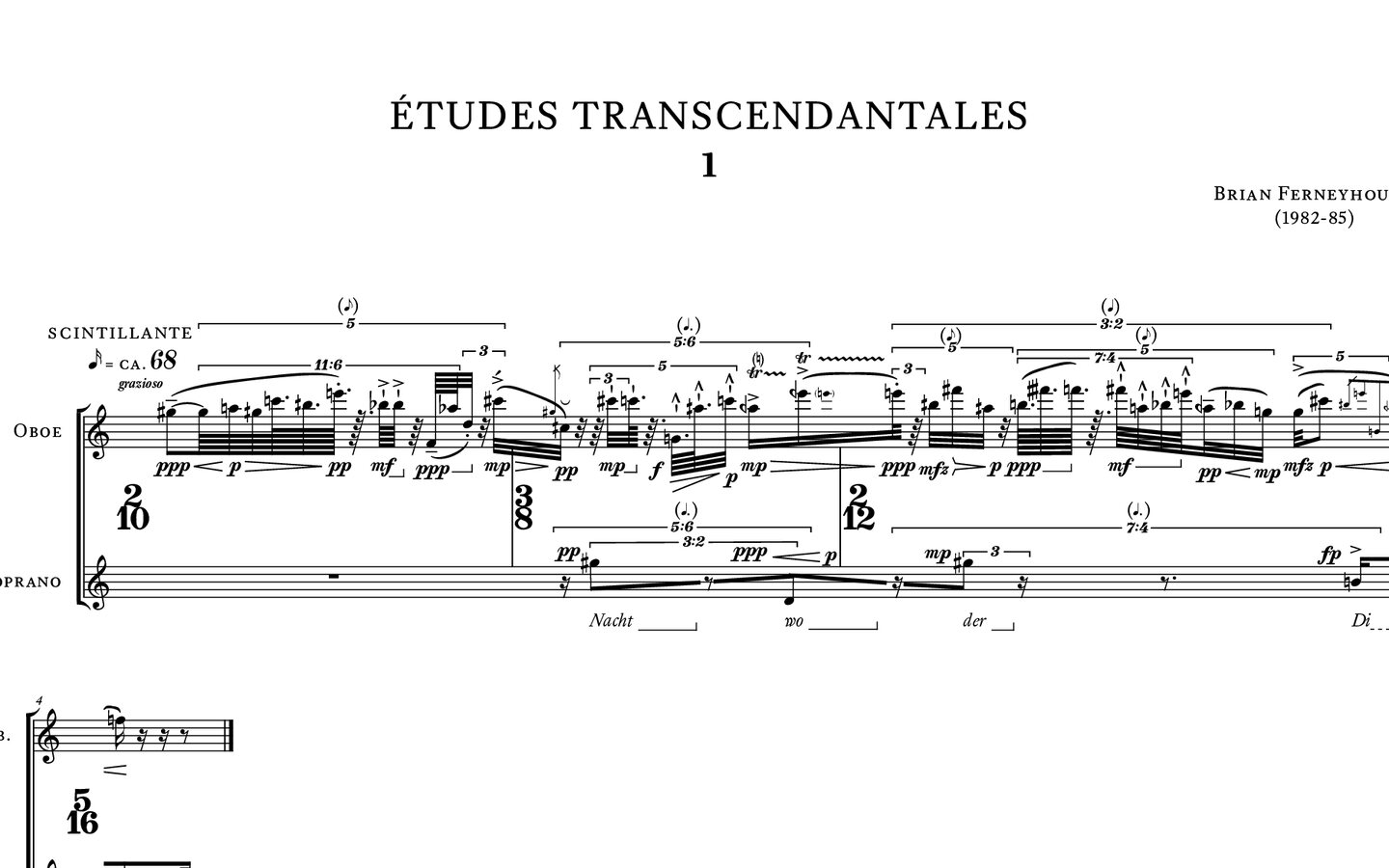

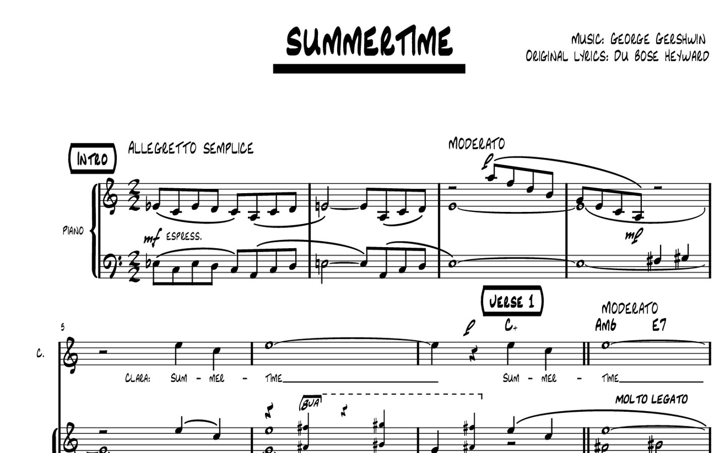
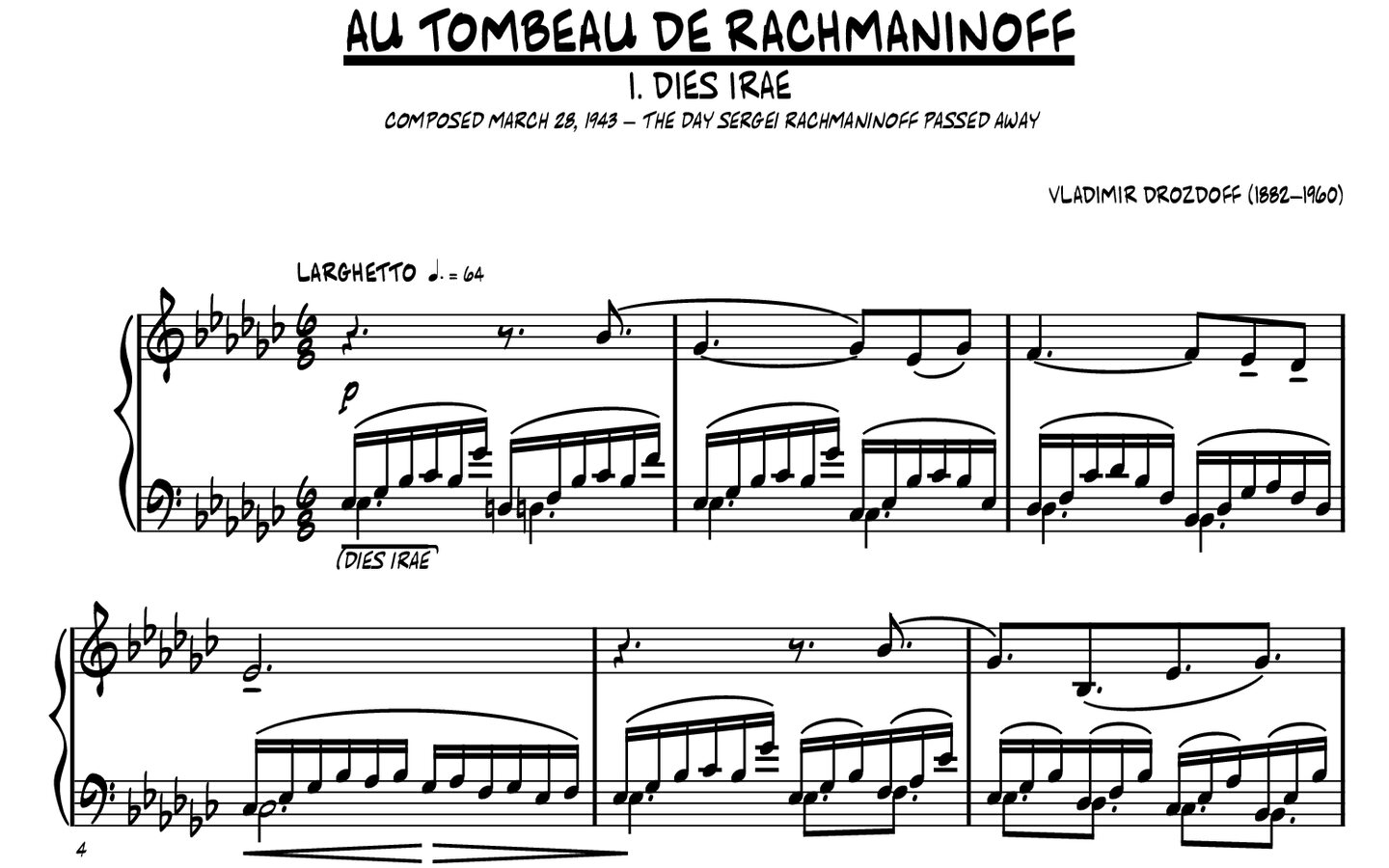
Which notation font should an engraver choose?
These are starting points, not absolute winners: judge the family in the repertoire and software you actually use.
| Score context | NorFonts to compare | What to inspect |
|---|---|---|
| Classical or chamber engraving | CapoScore, Concerto | Balance of noteheads, clefs, rests and accidentals at normal staff sizes. |
| Traditional printed character | Vintage Plate | Weight, contrast and the relationship of symbols to staff lines. |
| Jazz lead sheets or contemporary charts | RealScore, BlueNotes | Chord symbols, dynamics and quick reading during rehearsal. |
A fair comparison: for a final decision, engrave the same short passage in two candidate fonts and compare printed PDFs at the same staff size, page width and spacing settings. Different source passages, including those pictured above, are useful for inspiration but cannot prove one font is more readable.
Test the font in a real score
A font that looks excellent in a specimen can behave differently in a full page of music. Test it with chords, accidentals, tuplets, dynamics, articulations, text and multiple voices. The page should still feel calm and readable at the size you actually print.
Explore the engraved font families, then review sample scores on their individual product pages.
So what is the best notation font?
For an engraver, the best choice is not a single font name. It is the family that best matches the repertoire, publishing context, software and desired visual identity. Classical publishing may benefit from a refined engraved face; a big-band chart may be more convincing with a strong handwritten design; contemporary notation may call for something cleaner and more neutral.