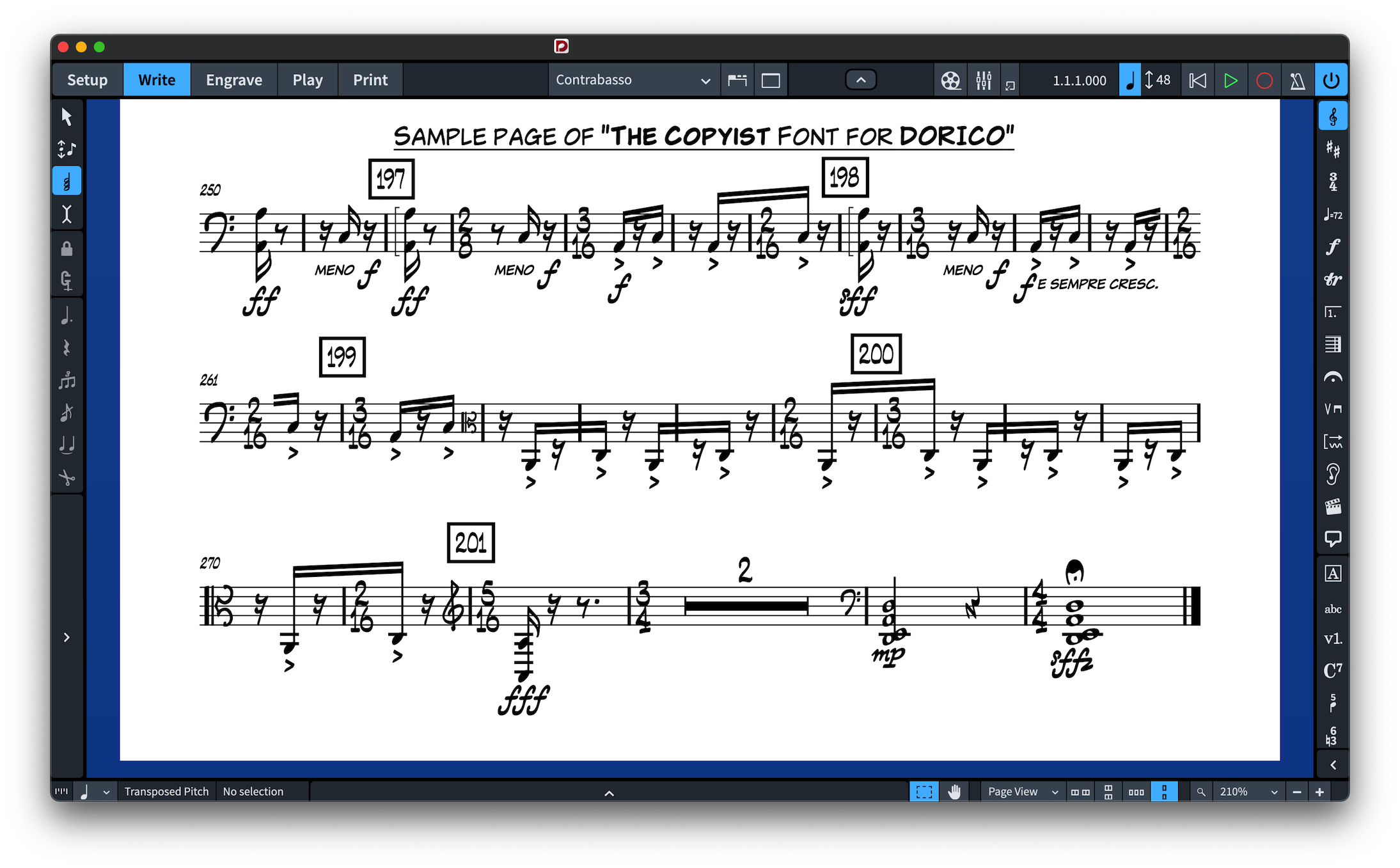
A handwritten music font can give a digital score the immediacy of traditional copyist work without abandoning the speed and consistency of modern notation software. The key is choosing a family that looks human while remaining clear in rehearsal, performance and print.
For NorFonts options, start with Handwritten Music Fonts or compare families in Compare NorFonts.
What creates a convincing hand-copied look?
The effect comes from more than irregular noteheads. Clefs, accidentals, rests, articulations, dynamics, numerals and companion text all need to share the same visual language. A successful handwritten family feels energetic and personal without making the notation harder to read.
Jazz, Broadway and commercial arranging
Handwritten notation is especially at home in jazz ensembles, lead sheets, rhythm-section parts, Broadway-style charts and commercial arrangements. These contexts have a long history of copyist notation, so a handwritten font can feel stylistically natural rather than decorative.
NorFonts families such as RealScore, The Copyist, Groove, The Arranger, BlueNotes and BopMusic explore different degrees of copyist energy and boldness.
Clean handwritten versus expressive handwritten
Real NorFonts score excerpts make these differences easier to see than an isolated notehead. The passages below are not identical, but they illustrate contrasting styles: compare the density of noteheads, accidentals, articulations and expressive markings. Click each example to enlarge it.
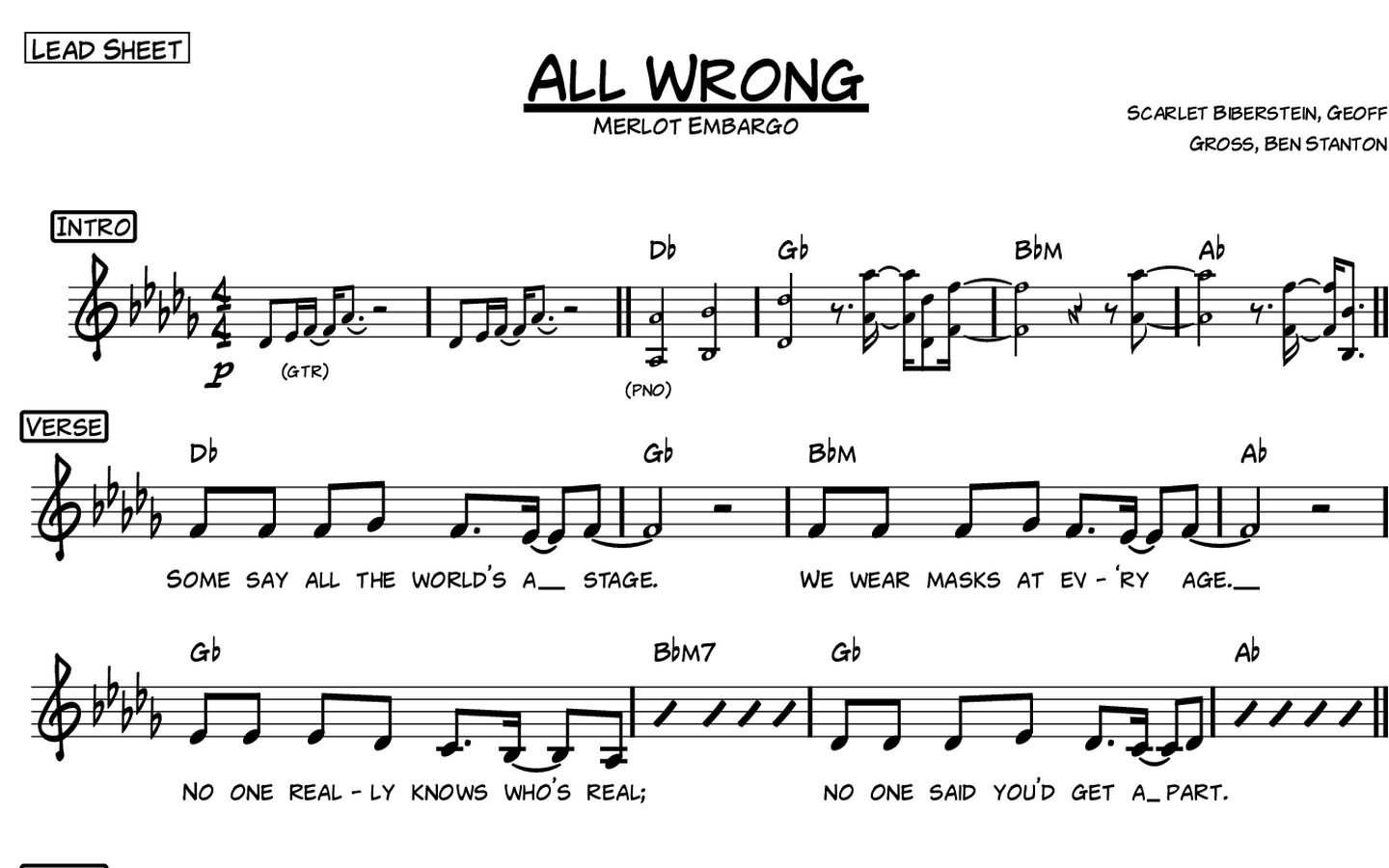
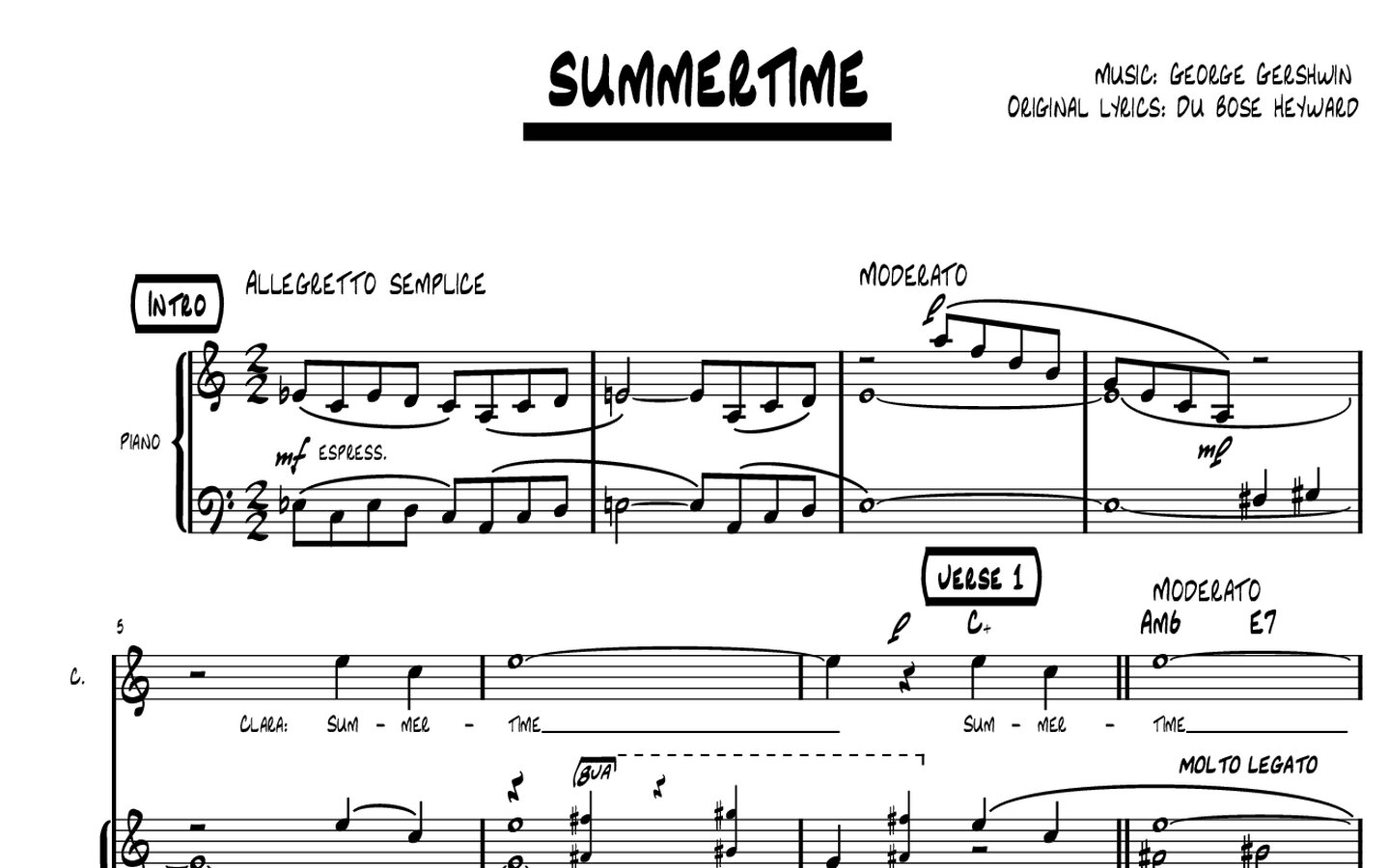
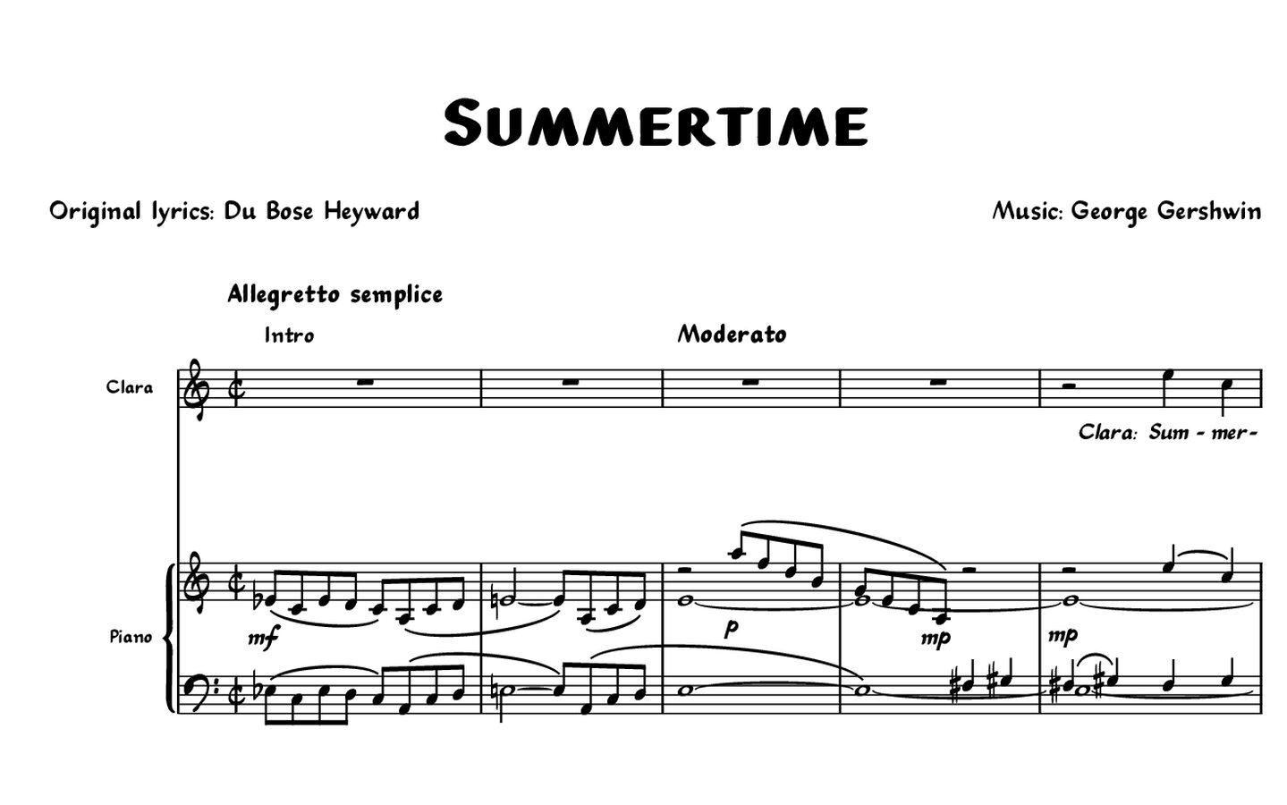
Practical test: compare any two candidates in the same four- or eight-bar passage, including repeated chords, accidentals, rests, articulations, dynamics and chord symbols. At normal rehearsal size, the visual personality should remain distinct without slowing down recognition.
A cleaner handwritten design can work well when performers need maximum legibility or when the score combines dense notation with a relaxed visual character. More expressive designs can be ideal for jazz and commercial material where personality is part of the page.
The choice is best made from full-score examples rather than isolated glyphs. Browse Handwritten Music Fonts and review the PDF score samples provided on individual product pages to judge spacing, density and texture.
Choose the correct edition for your software
Dorico, Finale v27+ and MuseScore 4.6+ users should choose compatible SMuFL editions. Sibelius users should use the dedicated Sibelius Music Fonts packages.
When an engraved font is the better choice
Not every score benefits from a handwritten aesthetic. Formal classical editions, scholarly publications and some contemporary concert scores may be better served by a more traditional printed voice. In that case, compare the Engraved Music Fonts collection.
A practical test
Try the font on a page containing accidentals, chords, dynamics, articulations and text at your normal staff size. If the page still reads quickly and the symbols feel like one coherent hand, the font is doing its job.