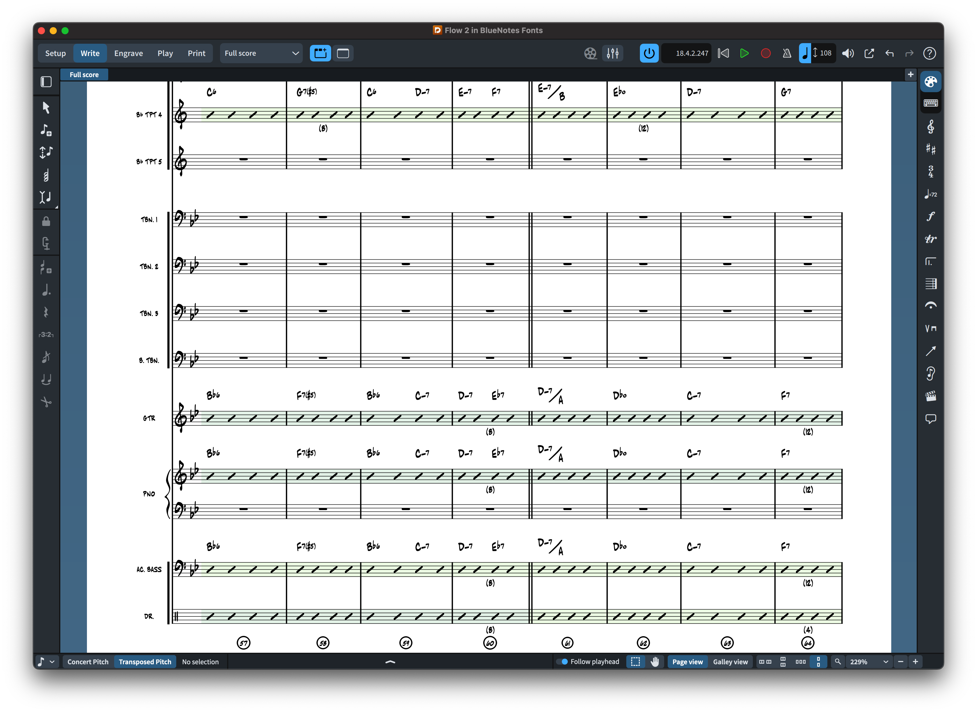
A good jazz lead sheet font should feel immediate, musical and easy to read at a glance. The handwritten look associated with jazz charts is not simply decorative: it grew from practical copyist traditions where clarity, speed and character had to coexist on the same page.
NorFonts offers several handwritten families for jazz, Broadway-style charts and commercial arranging. You can begin with Jazz Music Fonts or the broader Handwritten Music Fonts collection.
What matters most in a jazz lead sheet font?
Lead sheets often combine melody, chord symbols, rehearsal marks, lyrics or text cues and compact rhythmic information. The notation font therefore needs to remain clear when the page is relatively small and dense. Noteheads, accidentals, rests and articulations should be instantly recognizable, while the overall texture should retain a relaxed hand-copied character.
Chord charts need a coherent visual voice
The best results come when music symbols and companion text styles feel related. Chord symbols should not look as though they belong to a completely different document from the music itself. When comparing families, look at complete examples containing chord symbols and text rather than judging only the music glyphs.
Different handwritten personalities
Some charts benefit from a clean copyist look; others call for something bolder and more energetic. RealScore emphasizes the feel of a hand-copied jazz chart, while The Copyist offers a cleaner handwritten direction. Groove, The Arranger, BlueNotes and BopMusic provide additional visual personalities for arrangers and publishers.
Use real-score examples before choosing
These real NorFonts notation excerpts show three different approaches to handwritten jazz engraving. They are from separate source scores, not the same passage set in three fonts. Click to enlarge and compare the shapes and spacing of the symbols actually visible.
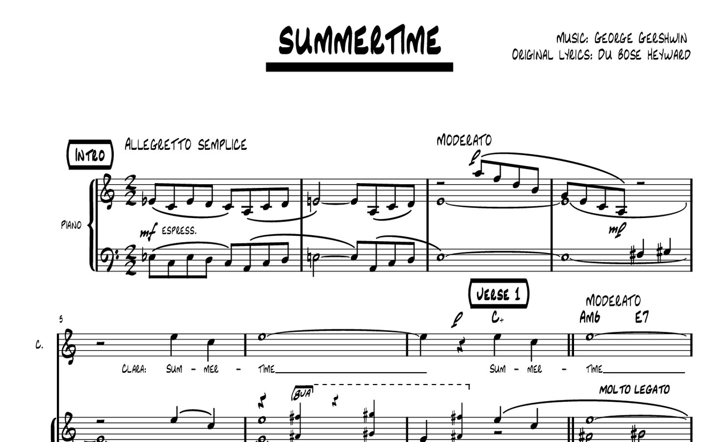
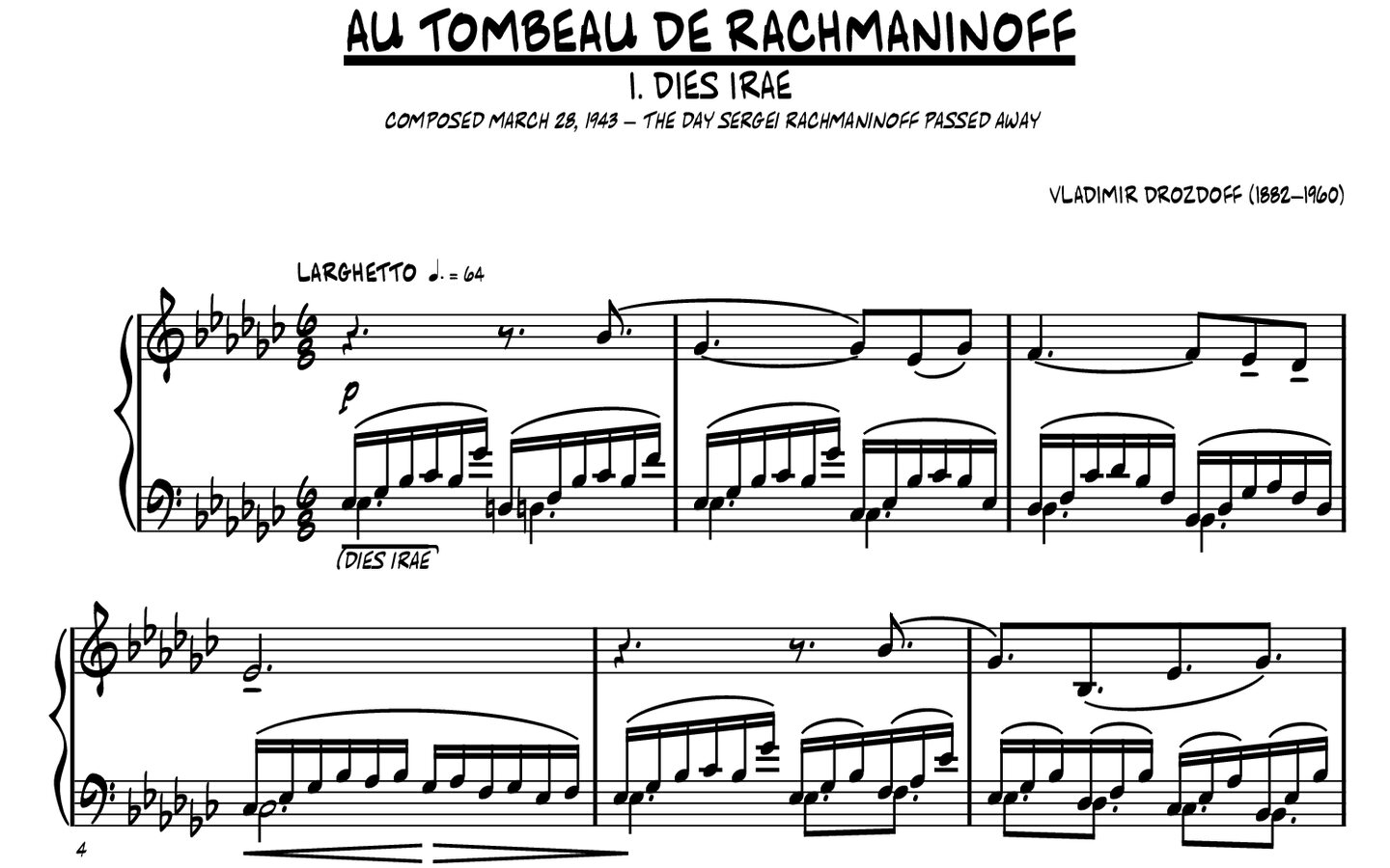
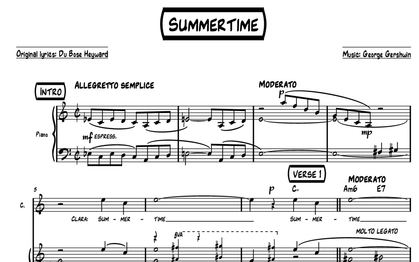
Check chord symbols, articulations and reading speed
Use a test lead sheet with Cmaj7, F#ø7, B♭7, rehearsal letters, a few staccatos and accents, and a syncopated melody. Look for readable accidentals and clearly separated chord alterations. The music-symbol font and any companion chord-symbol/text fonts may require independent styling: an attractive notehead by itself does not guarantee an equally strong lead-sheet heading or chord line.
| Use case | What to look for |
|---|---|
| One-page lead sheet | Clear chord typography and melody at reduced print size. |
| Big-band part | Legible articulations, repeat symbols and rehearsal cues. |
| Rhythm-section chart | Consistent chord extensions, slashes and rhythmic notation. |
A jazz font can look convincing in a specimen but feel too busy or too restrained in a real chart. Check sample scores containing syncopation, accidentals, chord symbols, dynamics and rehearsal marks. Use Compare NorFonts to explore families, then open a product page for PDF score samples.
Dorico, MuseScore, Finale and Sibelius
For Dorico, Finale v27+ and MuseScore 4.6+, choose the appropriate SMuFL edition. Sibelius users should choose a dedicated Sibelius edition. Product pages identify the intended software package.
Lead sheet versus full arrangement
A font that works beautifully for a one-page lead sheet should also be tested in denser parts if you plan to use it for big-band or commercial arranging. The visual character should survive more complex notation without reducing rehearsal readability.
Choose by feel, then verify by function
Start with the visual personality you want, then confirm readability, software compatibility and complete-score behavior. That combination produces a chart that feels handwritten without sacrificing professional usability.